The Grace O Foundation
—
A brand identity was created for The Grace O Foundation, a foundation whose purpose is to improve wellness and increase longevity across the U.S. Their mission is to help people to maintain a balanced nutritional diet and to incorporate a wellness program in daily life to enhance health and longevity.
Main Logo
—

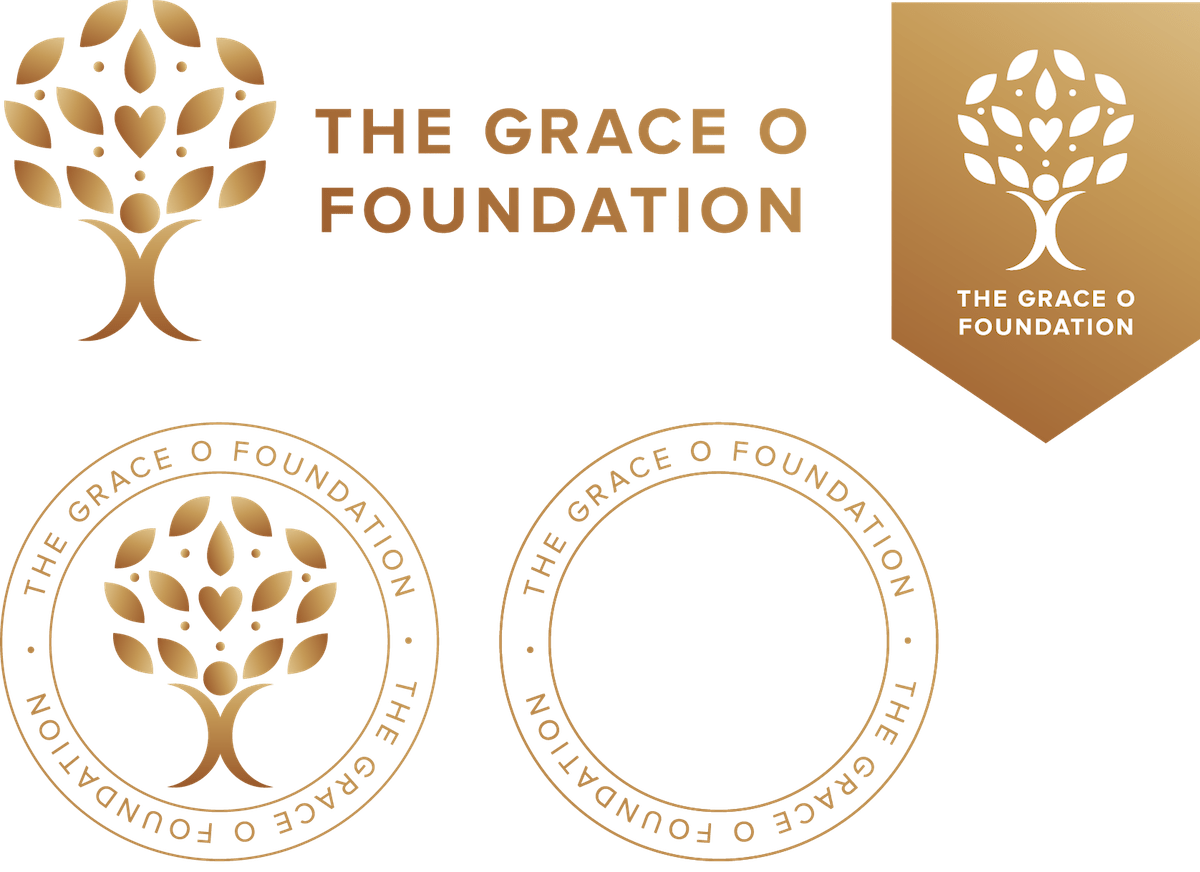
The Grace O Foundation logo was inspired by nature, health and peace. The logo depicts a tree with a heart in the middle of its crown of leaves to reflect the importance of wellbeing and health. The bark of the tree is depicted as a person supporting the crown of leaves to signify harmony and balance.
Secondary Logos
—


